Short answer
The best barbershop websites answer five questions within seconds, on a phone:
- Are you open? Hours, and ideally a live "open now" signal.
- Where are you? Your suburb, and directions in one tap.
- What does it cost? A clear price list.
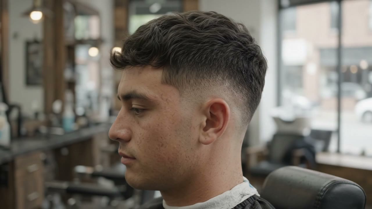
- Are you any good? Real photos of real cuts.
- How do I get in? Book, call, or "walk-ins welcome".
Style matters too. It should feel like your shop. But style never makes up for a missing answer.
Why the first five seconds decide it
Think about who actually visits a barbershop website. Most are on a phone, often nearby, often comparing two or three shops. They aren't reading. They're scanning for a reason to choose you, or a reason to go back to the search results.
That changes what "good design" means. A beautiful site that hides the hours below three screens of photos loses to a plain one that says "Open now · 3 min away · Skin fade $40 · Book".
Speed is part of it. Google treats a main-content load time of 2.5 seconds or less as good. A heavy site on mobile data can lose people before the first picture appears.
A great barbershop homepage, top to bottom
Here is the order that works for most shops. Each section answers the next question a customer has.
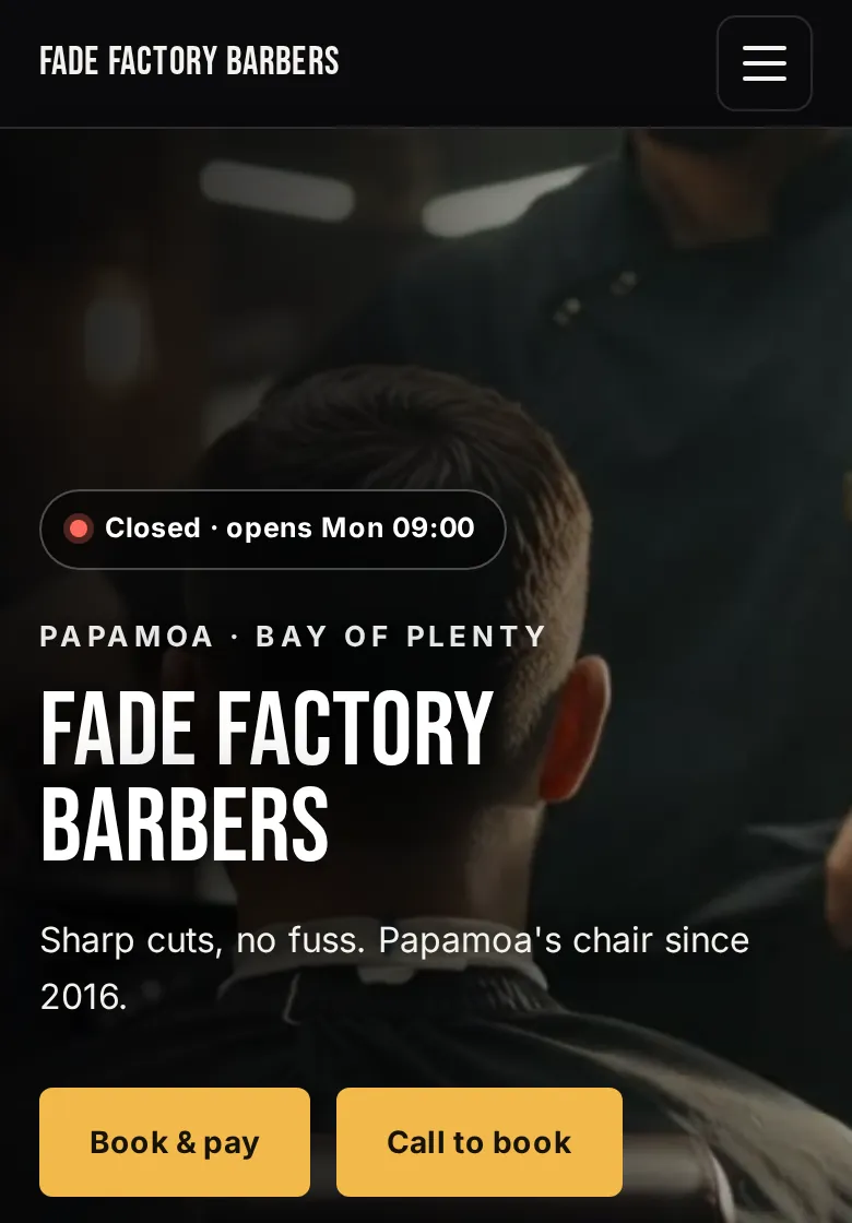
1. The hero: who you are, where, and whether you're open
- Your shop name, big and clear.
- Your suburb, so locals know you're theirs.
- A live open or closed status, with the next opening time.
- One line that says what you're about: "Sharp fades, no fuss."
- Two buttons: Book and Call. If you don't take bookings, make it Call and Directions.
2. Actions that follow the thumb
On a phone, a sticky bar at the bottom with Call, Directions and Book (or WhatsApp) means the customer never has to scroll back up to act.
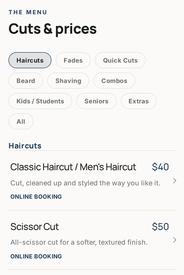
3. Prices
A simple list: cut, price, time. Kids' cuts, seniors, beard trims, add-ons. A hidden price feels like an expensive one.
4. Your work
A gallery of recent cuts from your own chairs. Fresh photos tell people you're busy and good. Ask each client before posting their photo.
5. The team
A photo and a line for each barber, including what they're known for. Regulars follow barbers, not buildings.
6. Hours, map and parking
Full weekly hours, a map, and one sentence on parking or how to find the door, especially in malls and arcades.
7. Reviews
Point people to your Google reviews. Only ever show genuine reviews from real clients.
8. The footer
Name, address, phone and hours again, exactly as they appear on your Google Business Profile. Consistency across the web helps Google trust your details. See our Google Business Profile guide.
Six design directions, with live examples
Your website should feel like walking into your shop. These are the six directions we build Buzz sites from. Each one is the same content in a different style, shown on a demo site for a fictional shop. Tap through to see each one live.
Classic: timber, brass, sharp
Warm and traditional, with gold accents on a dark base. Suits a shop with a timber fit-out, leather chairs and a loyal crowd of regulars.
Clean: white, black, daylight
Bright and minimal, with a light header and crisp type. Suits a modern shop with big windows and a calm, professional feel.
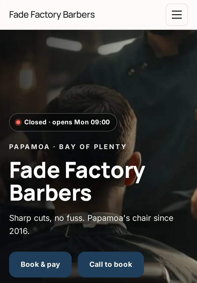
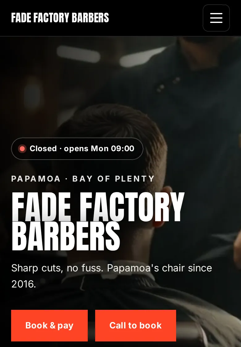
Bold: black, red, chrome
Loud, heavy type and strong colour. Suits a high-energy shop known for fades, designs and a big social following.
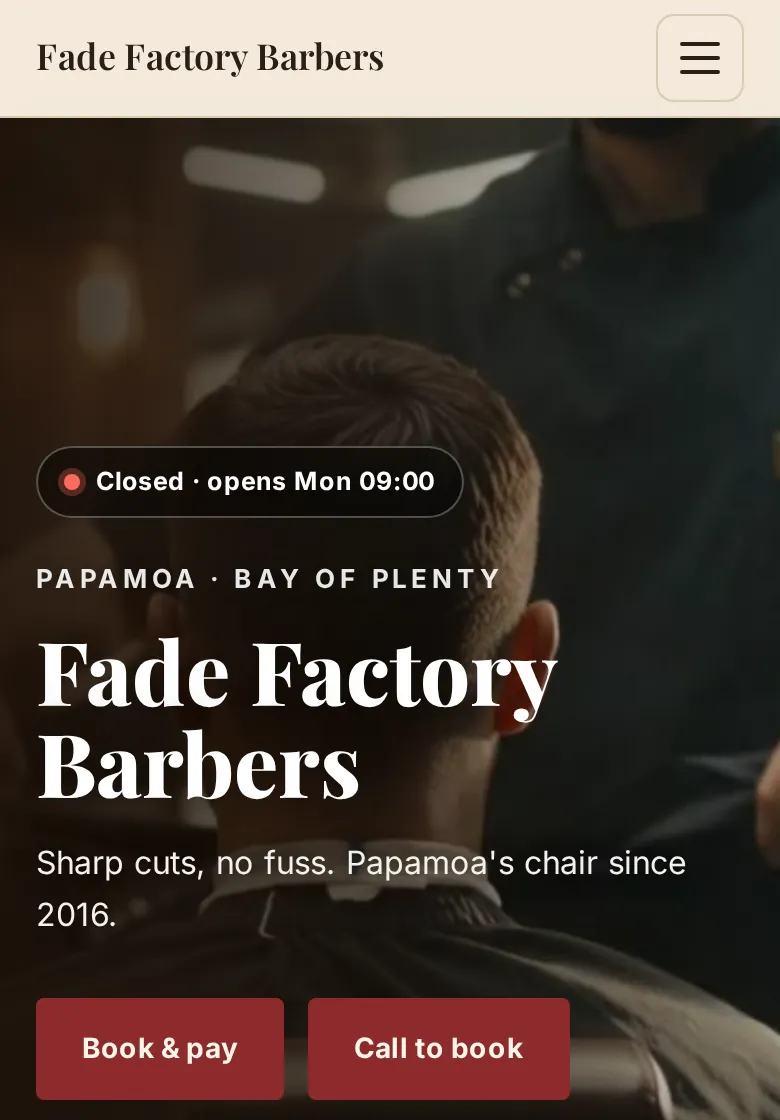
Heritage: tile, leather, old-school
Serif type, cream tones and deep red. Suits a traditional barbershop with hot-towel shaves, straight razors and a sense of history.
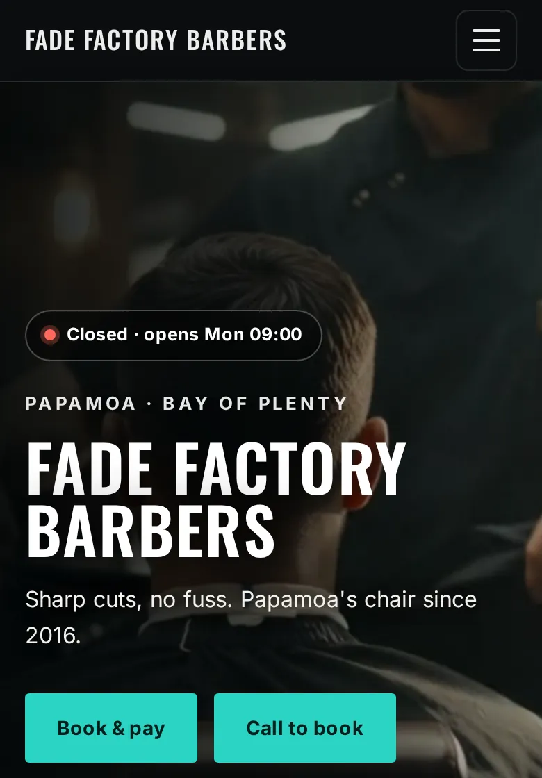
Urban: concrete, steel, amber
Industrial tones with a bright accent colour. Suits a city or warehouse-style shop with exposed concrete and a street-culture crowd.
Scandi: oak, linen, sage
Light, soft and natural, with a sage accent. Suits a relaxed shop with pale timber, plants and a calm pace.
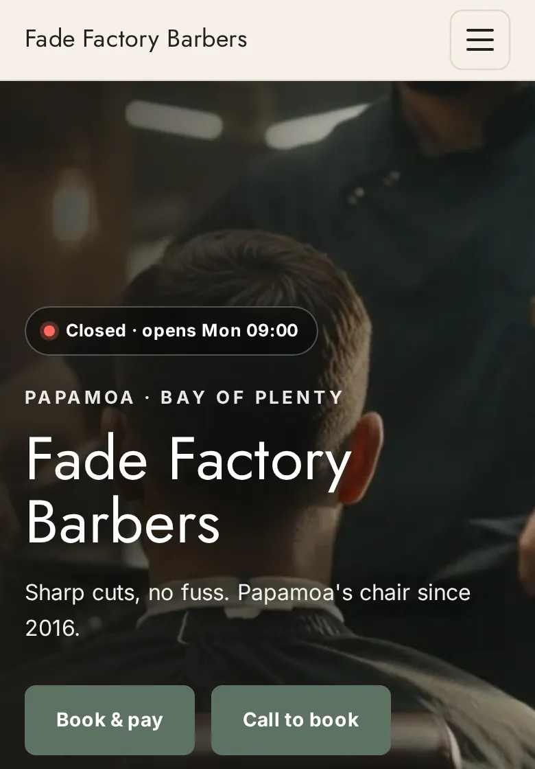
Whichever direction you pick, the content underneath stays the same: status, prices, work, team, hours, booking. The style should support the answers, never bury them.
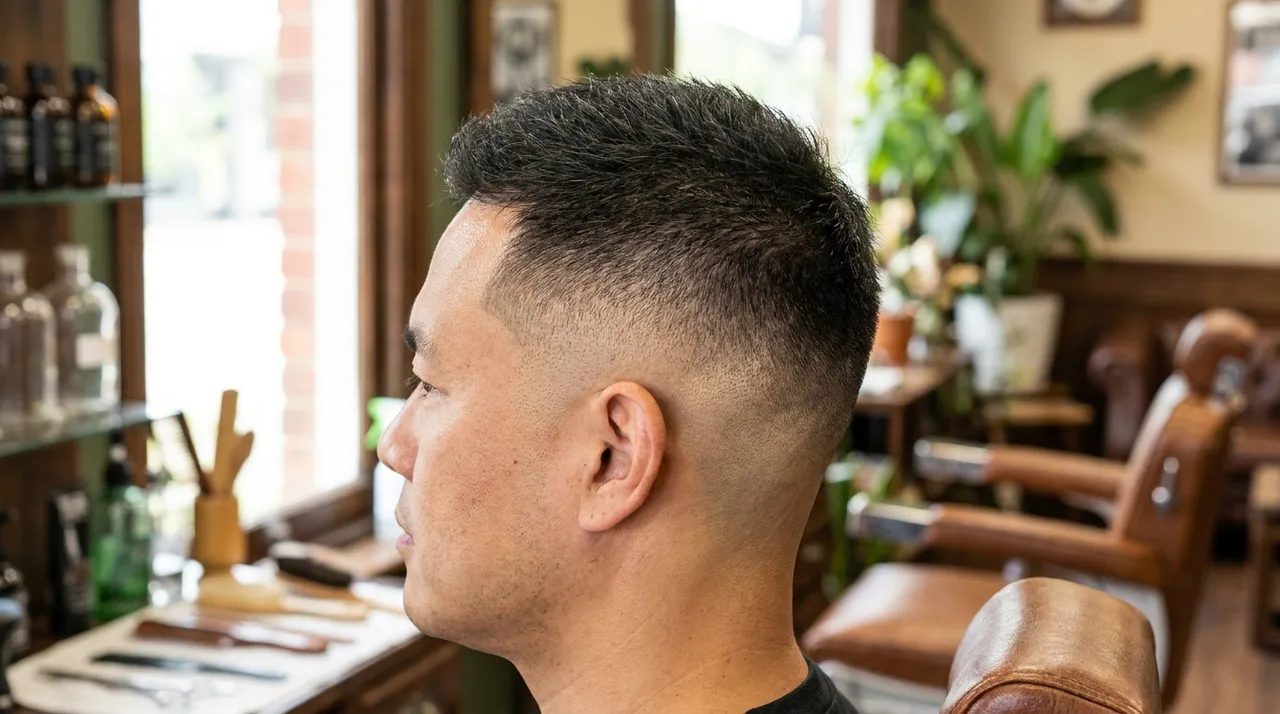
12 barbershop website ideas worth using
- A live busy or quiet status. "Flat out, about a 40-minute wait" saves a wasted trip and builds trust.
- A cut menu with names. Skin fade, taper, textured crop, buzz cut. It helps customers ask for what they want, and helps Google match searches.
- A "first visit" note. Parking, how long a cut takes, whether to book or walk in.
- A kids' cuts section. Parents want to know you're patient and what it costs.
- Barber profiles with each barber's specialty and their own recent work.
- A gallery you update from your phone, so it never goes stale.
- A short looping video of the shop in the hero. Muted, fast, and it sets the vibe instantly.
- WhatsApp or text button for customers who won't call.
- Holiday hours banner before every public holiday.
- A clear no-show policy next to the booking button, if you take deposits or card on file.
- A short FAQ: "Do you do beard trims? Do you take cash? Can I bring my son?"
- Your suburb in the page text, not just the map, so search engines know where you are.
Mistakes that send customers elsewhere
- Hours or prices only in an image, which search engines and screen readers can't read.
- A PDF price list that's awkward to open on a phone.
- Pop-ups on arrival that cover the one thing the customer came for.
- A social feed embed as the only gallery. When it breaks, your work disappears.
- Stock photos of models instead of your own shop and your own cuts.
- Old information: last year's prices, a barber who left, hours that changed.
- No way to act without scrolling: no call, directions or book button in view.
- Slow on mobile data because of huge images or video.
Pre-launch checklist
- Open the site on your own phone, on mobile data, outside the shop.
- Can you find the hours, prices and directions without scrolling past the first screen?
- Tap the call button. Does it ring the number someone will answer?
- Tap directions. Does it lead to your actual door?
- Try booking a slot, if you take bookings.
- Check your name, address, phone and hours match your Google Business Profile exactly.
- Check every photo is your own work, posted with permission.
- Ask a mate who's never been to your shop to find three things. Watch where they get stuck.
FAQ
What should a barbershop website include?
At minimum: your hours and whether you're open now, your suburb and one-tap directions, tap-to-call, a price list, real photos of your work, and a way to book or a clear note that walk-ins are welcome. Everything else is a bonus.
What makes a good barbershop website design?
A good barbershop website looks like the shop and works like a tool. The style should match the chair, whether that is classic timber, clean and bright, or bold and dark. It should also answer "are you open, where are you, what does it cost, are you any good, and how do I get in" within seconds on a phone.
How many pages does a barbershop website need?
Usually one strong page is enough, with sections for the essentials: hours, location, prices, work, team and booking. Extra pages only help if they answer a real question, such as a separate booking page or a page for a second location.
Should I use real photos or stock photos on my barbershop website?
Real photos wherever you can. Customers want to see your shop, your team and cuts you actually did. Stock images can fill a background, but your gallery should be your own work, posted with each client's permission.
Sources
- web.dev: Largest Contentful Paint. 2.5 seconds or less is "good".
- Google: Guidelines for representing your business on Google
Pick a look, we'll build it
Choose one of the six directions and Buzz builds your barbershop website with your name, prices, work and location, live within 24 hours. NZ$34.95 a month incl. GST, cancel anytime.
Get my site Browse the demos